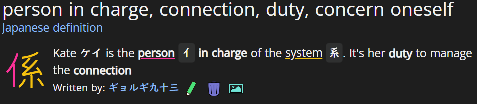
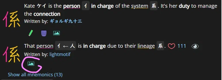
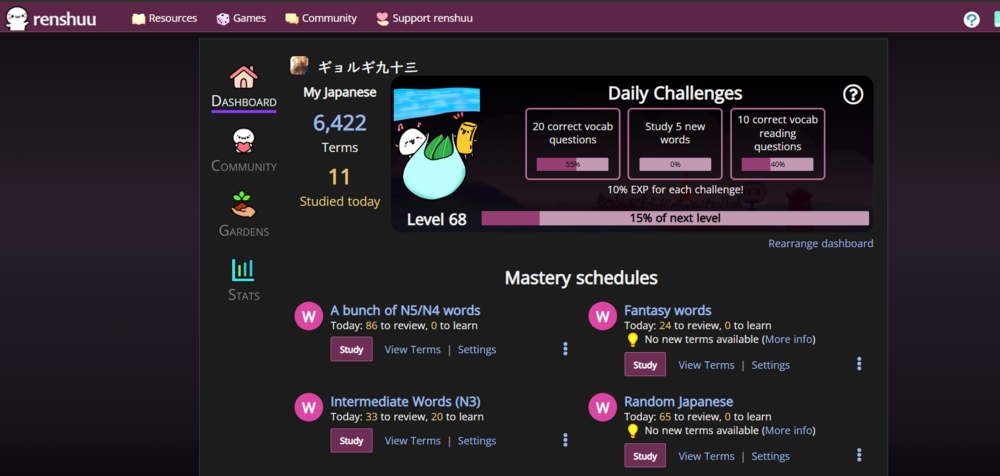
Well, this is silly, but since this is a request thread... and if someone wants to participate and has no idea...
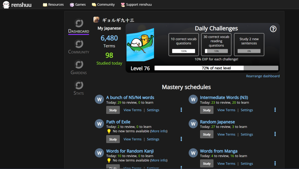
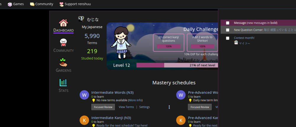
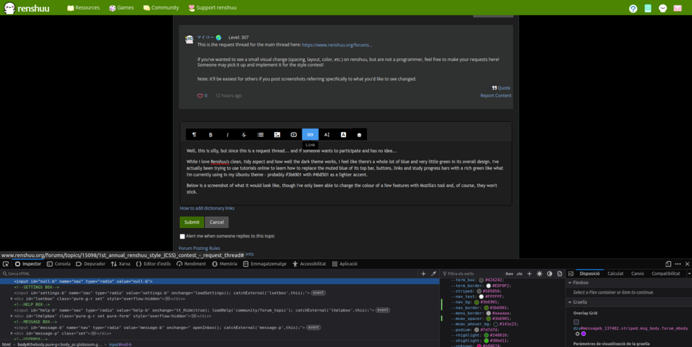
While I love Renshuu's clean, tidy aspect and how well the dark theme works, I feel like there's a whole lot of blue and very little green in its overall design - matter of personal preference, really. I've actually been trying to use tutorials online to learn how to replace the muted blue of its 1) top bar, 2) buttons, 3) links and 4) study progress bars with a rich green like what I'm currently using in my Ubuntu theme - probably #3b6901 with #4b8501 as a lighter accent.
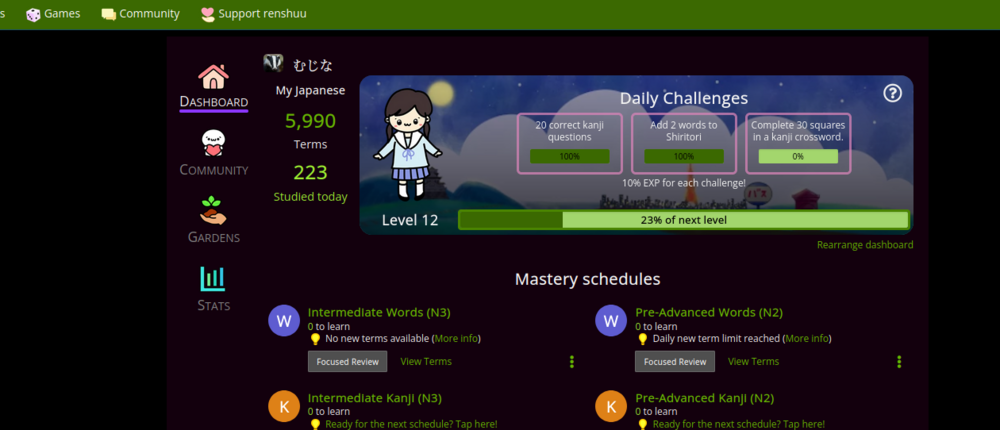
Below is a screenshot of what it would look like, though being a noob I've only been able to change the colour of a few features with Mozilla's inspector and, of course, they won't stick. I've also found someone's script for pasting into CSS Override, but it doesn't seem to work as intended.
I don't even know, am I managing to explain what I have in mind?


 Again these are just ideas for people and would be available to turn off in the settings so shouldn’t be too intrusive.


 I mean obviously it’s not mine to decide but I think you should keep the gradient


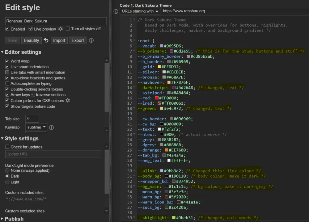
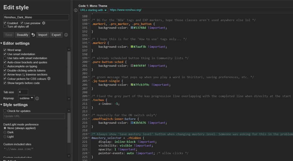
 I'll just give you a short guide here: