掲示板 Forums - 1st annual renshuu style (CSS) contest!
Top > renshuu.org > Announcements
Page: 1 of 2
Getting the posts
Page: 1 of 2
Top > renshuu.org > Announcements
This is our first attempt at a contest that isn't art related, so I hope it goes well! 
What: renshuu, both the app and the website,
use HTML/CSS under the hood to style up the crazy amount of content
present. Over the years, I've had tons of users offer changes to the way
things are laid out, and I wanted to make a way for those familiar with
CSS to help the community out!
This contest is for any CSS that you want to add to renshuu, whether it's a new color scheme, some small change you've always wanted to see on a tiny part of one page, and everything in between.
How to enter:
1. You'll need a desktop/laptop for this. Most people will want to use an extension like Greasemonkey or Tampermonkey, which allows you to inject CSS into a website.
2.
Log into renshuu.org (you can use the same user account as the renshuu
app), then get to making all those changes you always wanted to!
3. When finished, please post on this thread, with the following pieces of info:
--- What it does / where it affects
--- Screenshot
--- Link to online website containing the CSS (for example, https://pastebin.com/)
When:
Entries will be accepted during all of October 2025. Winners will be announced in November.
What you can win!
We'll be choosing ten winners!
The #1-3 entries
will receive both 6 months of renshuu pro.
The #4-6 entries will receive 4 months of renshuu pro.
The #7-10 entries will get 2 months of renshuu pro.
All participants will get a little something for their Kao Garden.
Important notes:
1. If you are not familiar with CSS, but have a visual change you'd like to request, please use the request thread: https://new.renshuu.org/forums...
2. If more than one person fulfills a request, the earliest one will be considered unless significant changes were made.
3. You allow renshuu the ability to use your contribution to make renshuu better for everyone!
4. Only CSS, no Javascript. No external sources allowed (links to remote fonts, etc.)
5. You can enter as many times as you'd like.
6. My apologies in advance for the mess that is renshuu's CSS, should you go looking.
If we get enough entries, I plan on making a "style" selector section in renshuu's settings where you can turn on user-made (after verification from renshuu) style changes! I hope we can built up a library of user "mods" to renshuu's style/layout open to all users!
Just CSS, no adding new HTML, and no JS? For example - changing the colour of the progress-bar?

This would be accepted, but if I wanted to write some code that dynamically changes the colour based on EXP, that wouldn't, right? I'm not really sure what I'd change. I guess I'll be looking at the request thread 😄
Due to the additional potential complexity of mixing JS into what renshuu already has, and because this is the first time we're running a contest/project like this, I think I'd like to keep the scope a bit more limited, and perhaps expand it out in the future.
Got it! Is the idea for each entry to be something more expansive, or are minor changes also welcomed? For example I don't really like the look of the "boxes" for the Daily Challenges (in Dark mode). Would something like this be fine?
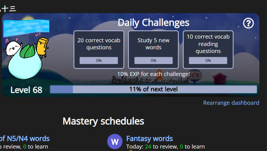
All I did was edit the colours for "--progress_border: # a5accb;" and "--challenge_bg: # 2b3243;" - so it doesn't really warrant a pastebin.
Sorry for asking so many questions 😅 (if something like this is fine, you can count it as my first submission).
I'll make an actual skin when/if I have the time :)
Entries can be a short as a single line. However, if you have several changes to a single area, probably better to submit them together.
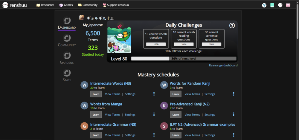
I made a full (mostly) skin/theme. It needs Dark Mode in order to work properly. Theme is "Dark Sakura". You can see what it changes in the screenshots (although not showing everything). Only other thing I did was take a request from @いのしし to make the kao-coin showcase section larger (doubled the fixed height and increased the size of the coins by 30%). Probably doesn't break anything.
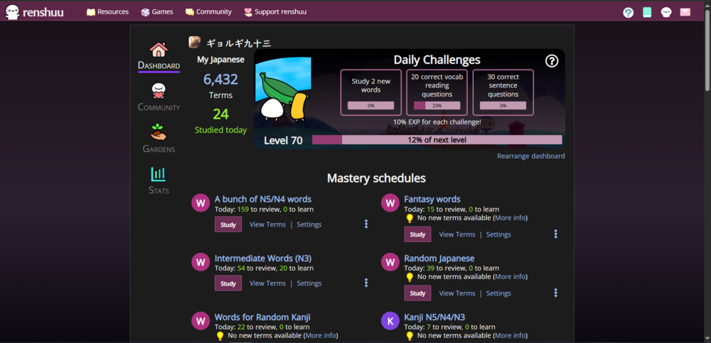
Here's the CSS: https://pastebin.com/EFxp5yfZ
Update: Here's a video (didn't like how the screenshots looked) - https://streamable.com/k6fo9u
Let me know if you want me to trim it fully (only leave what I've actually changed), write proper comments or format it better.
Imma go sleep now 
Funny to see this happen.
Following up on my suggestion from a week or two ago, a better looking conjugation table, though this time it will work on both portrait and landscape screens. It has some minor effects on other tooltips (notably the "has done x vocab today" hover TT) as it shares the same div with all others despite being an entirely different format.
I have also had a look at the rest of the stylesheets and maybe it would be better to clean those up at some point

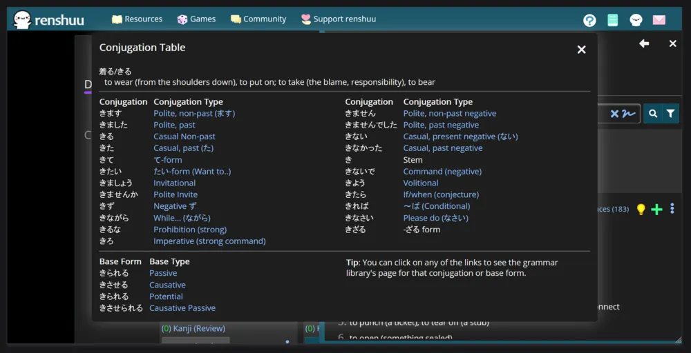
works on wide..
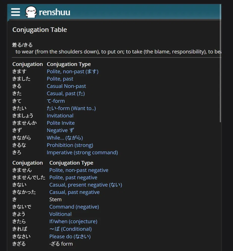
..and also on tall screens
I made another Dark mode theme. This time it's more or less complete. Haven't tested it too much on mobile, but there don't seem to be any issues on PC (at least not for me). I've also written a lot more comments this time around. Might do one Light theme, and then move on to UX.
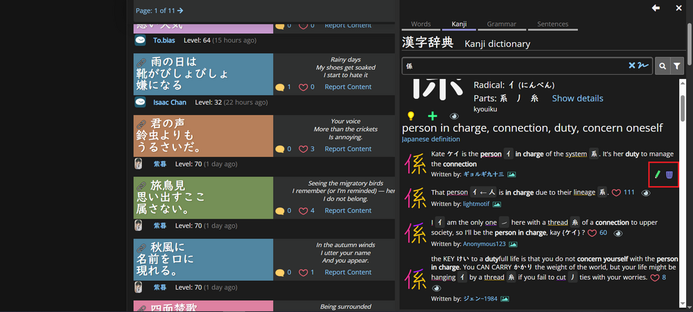
Feature list:
New location of Edit and Delete buttons for your own Mnemonics (marked with a red square)
Short video: https://streamable.com/i2z80q
Link to CSS: https://pastebin.com/Efq3NdX1
(version 1.0.1)
Hotfix: "Submit answers" button for the "Complete the vocab" questions type was blending into the background.
Update (24/10/25): I won't be updating the CSS (too lazy), but I've made a few more changes for personal use:
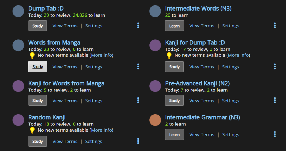
Better visibility for the Counter Punch number:

Also reverted to base Haiku colours for practical reasons.
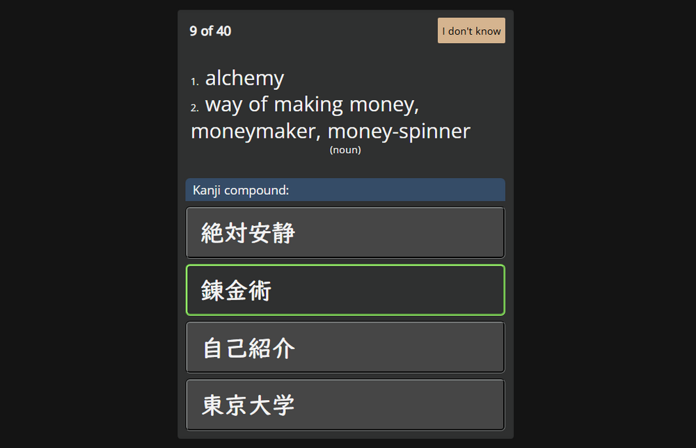
(Update 1.0.2) Styled the quiz answers to be more minimalist/basic:
Regarding the contest description, I would like to note that suggesting Stylus is better for pure CSS changes, as it won't even let you use any JS.
Yeah, that's what I use. The live preview feature is really nice. I also have Tampermonkey, but not for the contest.
I'd also recommend it over a userscript manager.
You can just use the developer tools built into both Chrome and Firefox, without a plugin/extension.
Under Firefox's developer tools go to Style Editor and just click the Plus icon to add a blank style sheet to paste/edit directly, or the import button to load a CSS file.
Under Chrome's developer tools go to Sources and then Page and expand top -> app.renshuu.org -> main, right-click pc.min.1759929662.css and choose Override content and choose the folder for it. You can now edit it locally.
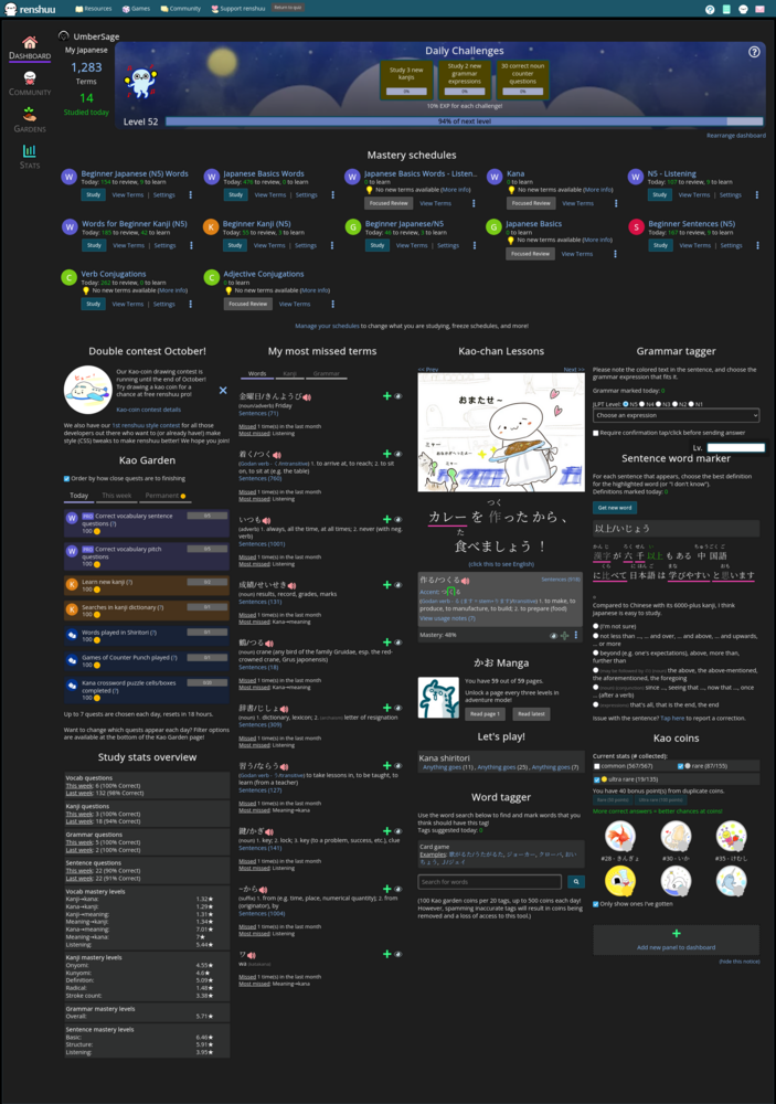
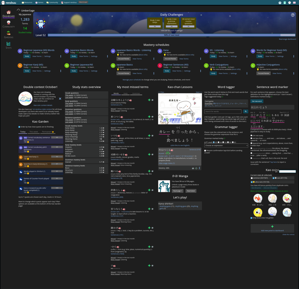
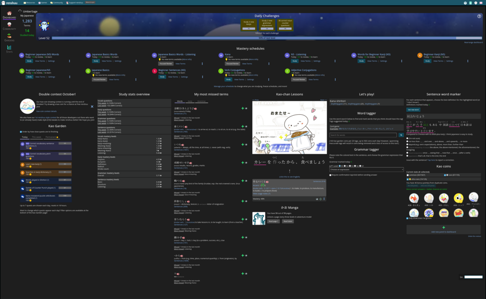
One of the things that I've always wanted for renshuu.org is a wide layout. So here's some simple changes to the home page to make it wide.
https://gist.github.com/jb-lop...
The other pages would still need some tweaking. If you think a wide layout is good, I can do the rest too. Here's some screenshots at the breakpoints I set up.

720p
1080p
2k (1440p)
4k (2160p)
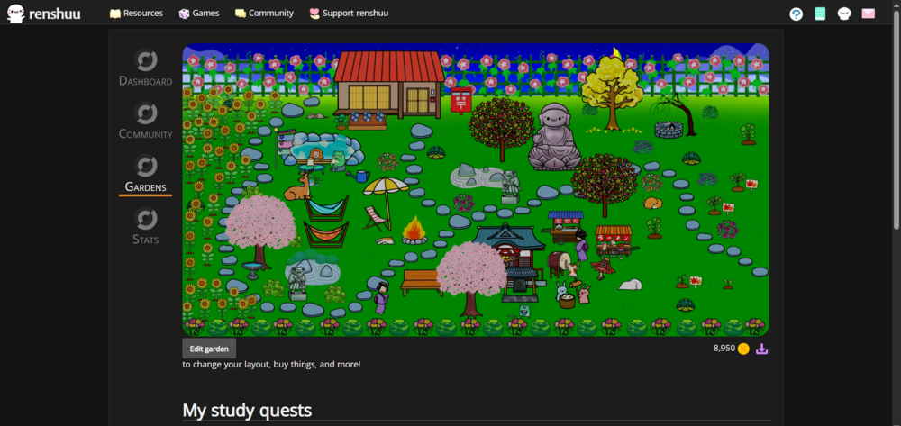
@UmberSage Wide layout looks great! While testing it I also noticed I could see my whole Garden. Upped the max-width for myself a bit (1150px), just enough so it shows fully. That's one of my pet peeves gone. 
Hello! Since it's the Halloween month, I decided to create a Dracula-inspired theme. I hope you guys like it! To get the theme to work right, you need to turn on dark mode.
I'll be working on the theme throughout the week.
Changes:
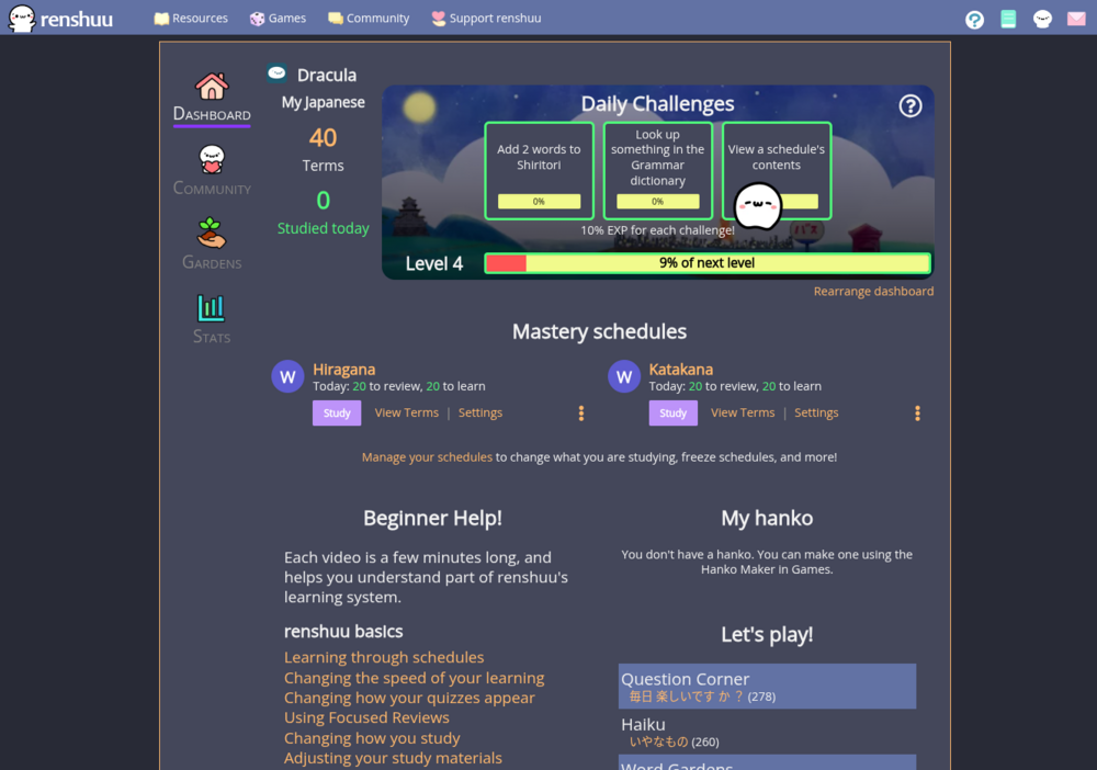
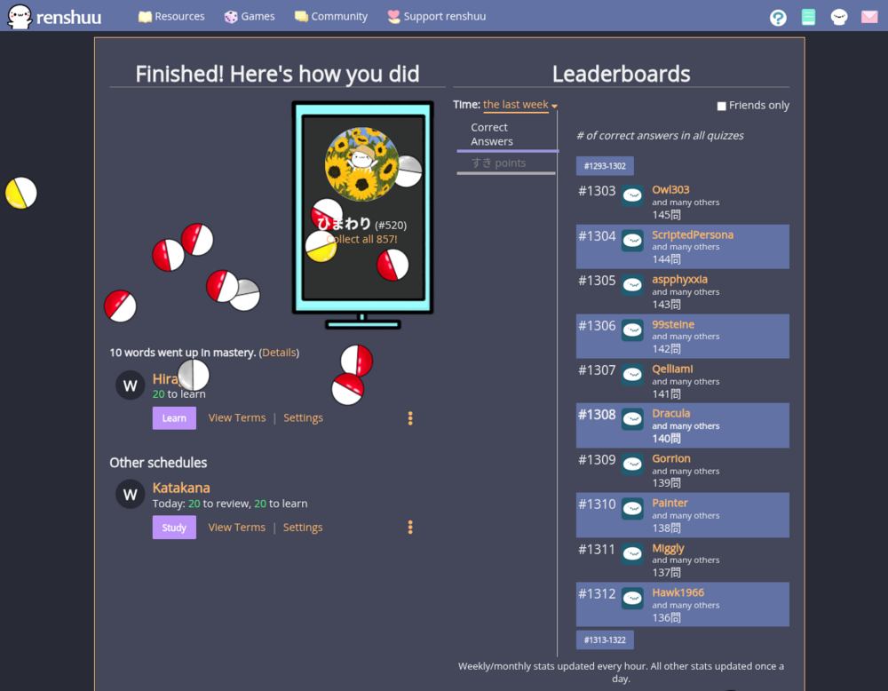
CSS Stylesheet: https://gist.github.com/viccios/3a044a1697e7be355016d9288d89c454
Hi! I made a colour theme based on the Apollo colour palette.
It mostly changes the colour of elements and some minor visual tweaks.
I've only tested it using dark mode so it might not work properly in light mode.
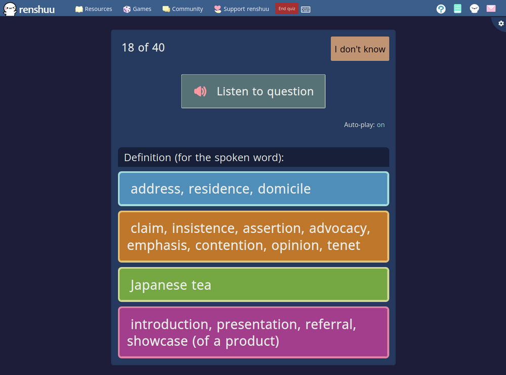
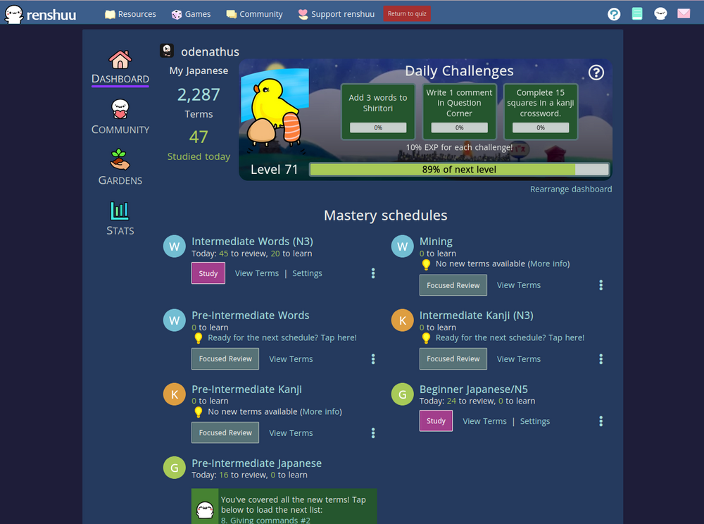
Hi, I'm quite new here,
I don't necessarily want to win anything, but to share some ideas :
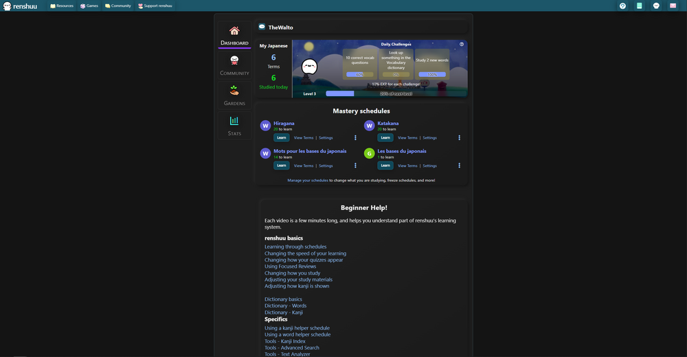
Pastebin CSS File : https://pastebin.com/Mrsp0JGZ
It changes the homepage (dark theme), the tooltips, some inputs, the stats tab, the garden tab and the kana charts.
Theres slight adjustments and small animations.
I might post an update for further improvements and fixes.
FYI I took some ideas from ギョルギ九十三 , so if it wasn't legit I give all credit to ギョルギ九十三
@TheWalto Don't worry about it, I don't mind :)
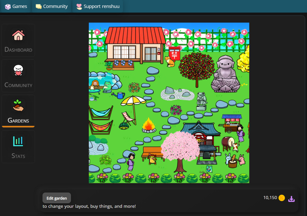
All of the menu effects are very nice. One thing you could improve is the Garden. It's very small if you have the extension upgrade.
ギョルギ九十三
I'll take a look, but I kept its default value max-width: 500px;
What is the extension upgrade ? Is it the premium plan or a browser extension ?
there's a lot to improve, I'll do this when I have the time for it :)
ギョルギ九十三
I'll take a look, but I kept its default value max-width: 500px;
What is the extension upgrade ? Is it the premium plan or a browser extension ?
there's a lot to improve, I'll do this when I have the time for it :)
It's an upgrade you can buy at the Garden Store, I think it was 75k coins. Just gives you more horizonal space. You don't need to have, just look the profile of someone who has it. Just a suggestion, you don't need to worry about it.