掲示板 Forums - [ANDROID] Visual issues
Top > renshuu.org > Android renshuu
Page: 6 of 6
Getting the posts
Page: 6 of 6
Top > renshuu.org > Android renshuu
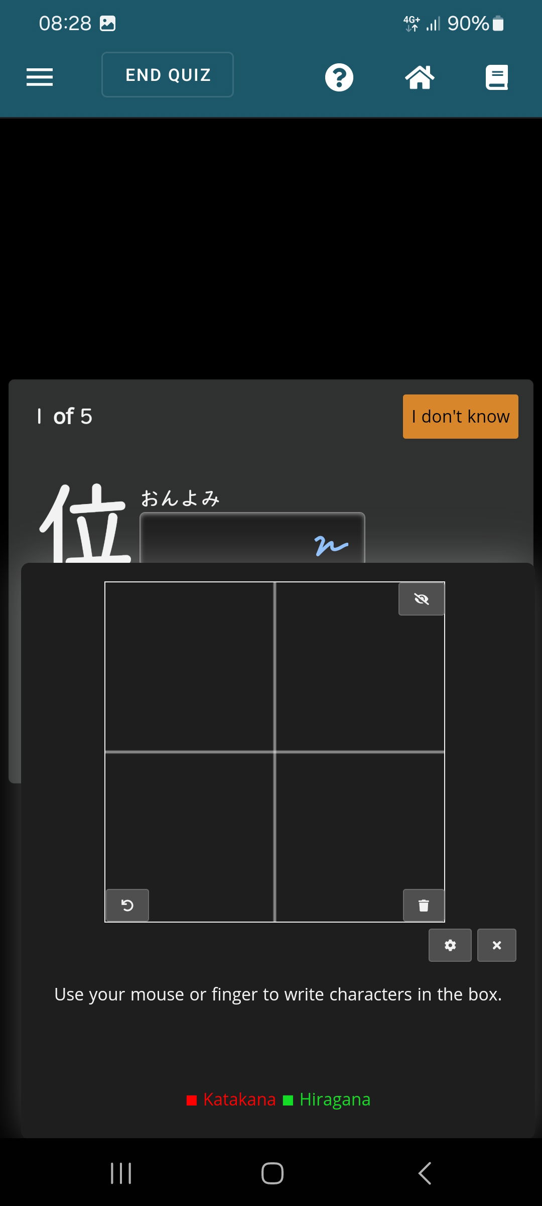
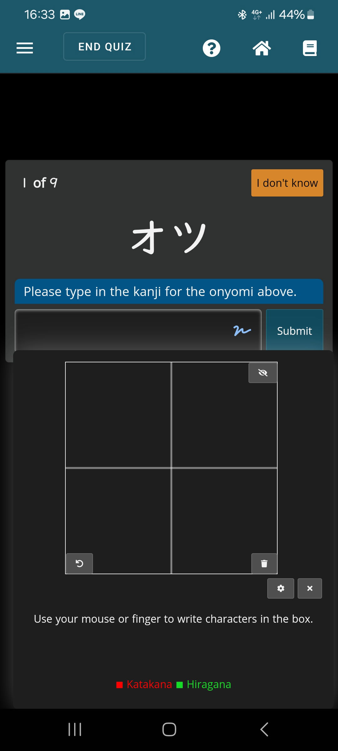
On Android phone (Galaxy S21), when doing a quiz and writing on or kun yomi, the validate button gets hidden when tracing the characters. There is all that empty space at the top where the question area could go (and it does so when using a real keyboard). Could be nice to correct the spacing. Quiz is still usable but it's a bit annoying to close the writing window with my big fingers.

Mostly yes, any kanji to reading has the same issue. There is a tiny bit of overlap when doing on/kun reading to kanji but the button is still accessible:

I see - this is an excellent hint. I'm not too concerned with the overlap on the second screenshot, but this means it is isolated to when the input fields are further up. I'll try and look into this as soon as I can!
Sorry, an update (and request for clarification) - are you hoping to have the box hook onto the bottom of the actual question box, instead of the input field?
I think it's a good idea for visibility, it would work. either that or instead of a hovering box, 'splitting ' the screen in 2 and have the writing pad on bottom (but it might be way more work to code, now that I think about it)
I'll keep that in mind, thanks. It's might not be something I can work on at the moment - the idea currently is that when the drawing pad is being used, there's no need for anything other than the input, but in short, you'd like to be able to submit from within the box, correct?
That seems reasonable - let me think on it, and if it's something I can add, I definitely will!