掲示板 Forums - [ANDROID] Visual issues
Top > renshuu.org > Android renshuu
Page: 5 of 6
Getting the posts
Page: 5 of 6
Top > renshuu.org > Android renshuu
Do you mind trying this for me? Go here: https://css3test.com/
The resulting page is extremely long. Search for the area titled this:
Custom Properties for Cascading Variables Level 1
and let me know what it says!

It says :D (good?), but i'm not sure if that's specific to my browser or my device. The Kao coin machine displays correctly in the browser, but not in the app.
Yea - at one point, the browser and the webview (that's what a browser is called when it's inside of another app) was split into two different programs in Android. I did not think that 6.x versions of Android had that issue, though. I'll continue to look into it!
Android 8, Samsung Galaxy A5.
Noticed some creepiness in my kanji quiz this morning, this time not on my weird e-reader. When I answer incorrectly on a question that's asking for a kanji, the incorrect kanji in the red box has a ton of red static over it. I didn't screenshot it, but the red box between the correct answer and incorrect answer also has some static in it, in around the same area as the kanji in the other box. Pressing "display choices" on the next question changes the amount of static in both.
It only seems to happen when the incorrect answer is a kanji. The incorrect answers for onyomi/kunyomi questions render fine.


WOW. I've never seen anything like that. Especially in that first picture.
Let's try and eliminate some possible causes. First, try disabling that lovely font and switch back to the original one, and see if that helps at all.


Seems the font isn't a factor. While taking screenshots I accidentally switched apps, and switching back to the Renshuu app also changes the static (2nd screenshot is after I switched back into the app from the 1st). I didn't check every button, but the static also seems to change when pressing buttons in the quiz interface (like "mark correct" & "display choices").
This is all in the 2020111730 app version btw.
Just to be safe, try removing the app fully and reinstalling it?
Still has static after reinstalling. Still only in kanji quizzes, though, and only on the incorrect portion of the answer on meaning/reading -> kanji questions. Incorrect kanji answers in vocab quizzes & kana/meaning answers in kanji quizzes aren't affected at all.
Well, hmm..I honestly don't know what could cause this. Although I unfortunately doubt that this will expose any useful information, go ahead and send one in-quiz report the next time you see it.
Android version 11, Google Pixel 3, kanji quizzing
Not sure if this has been mentioned before, but when quizzing in the Android app (kanji, but maybe vocab too), some of the English definition answer choices are too long and only the first part of the definition is displayed.

It would be really helpful to be able to see all of the definitions. Is there a way to make them word wrap?
EDIT: Poked around and found the setting to change this. Please disregard!
Nothing better than seeing a bug report, going to read bug report, seeing it already resolved!
Pleased to oblige? (笑)
Like I mentioned in another thread, coming back to this site after a long period (several years?) of inactivity, Renshuu has changed and grown a lot and is very feature-rich, so I am still fumbling around trying to figure everything out. お騒がせして失礼致しました!
Yes, it's seen a lot of growth, especially in the last eighteen months. I'm excited to see where we can bring it in the coming months!
Alignment issue. Teclast Android 10 Tablet M40 10 inch. Renshuu App rv 1.0.20211231
Onyomi % align off. Not all screens though. Was practising Kanji
.

Occlusion\Overlap issue. Teclast Android 10 Tablet M40 10 inch. Renshuu App rv 1.0.20211231
On the gacha screen clicking normal settings text results in popup dialogue box tick box options being covered.

Occlusion\Overlap issue. Teclast Android 10 Tablet M40 10 inch. Renshuu App rv 1.0.20211231
On the gacha screen You Have a bonus button partly covering outer area.

I think the overlapping and sizing should be better? Although that "monitor" next to the gacha is a fixed size, so don't have much space to work with.
The % for the mastery level is actually..a constant source of trouble, so unless I can figure out how to replicate it, it might need to stay the way it is.
Will report back if the issue of overlap comes up again, thanks.
Reveal definition text message shown in title card even after already revealed see screenshot.

The spoiler tag should be working better - let me know if you still see the issue!
Android device/model: RMX1821
Android OS version: 10
App version: 1.1.20230701
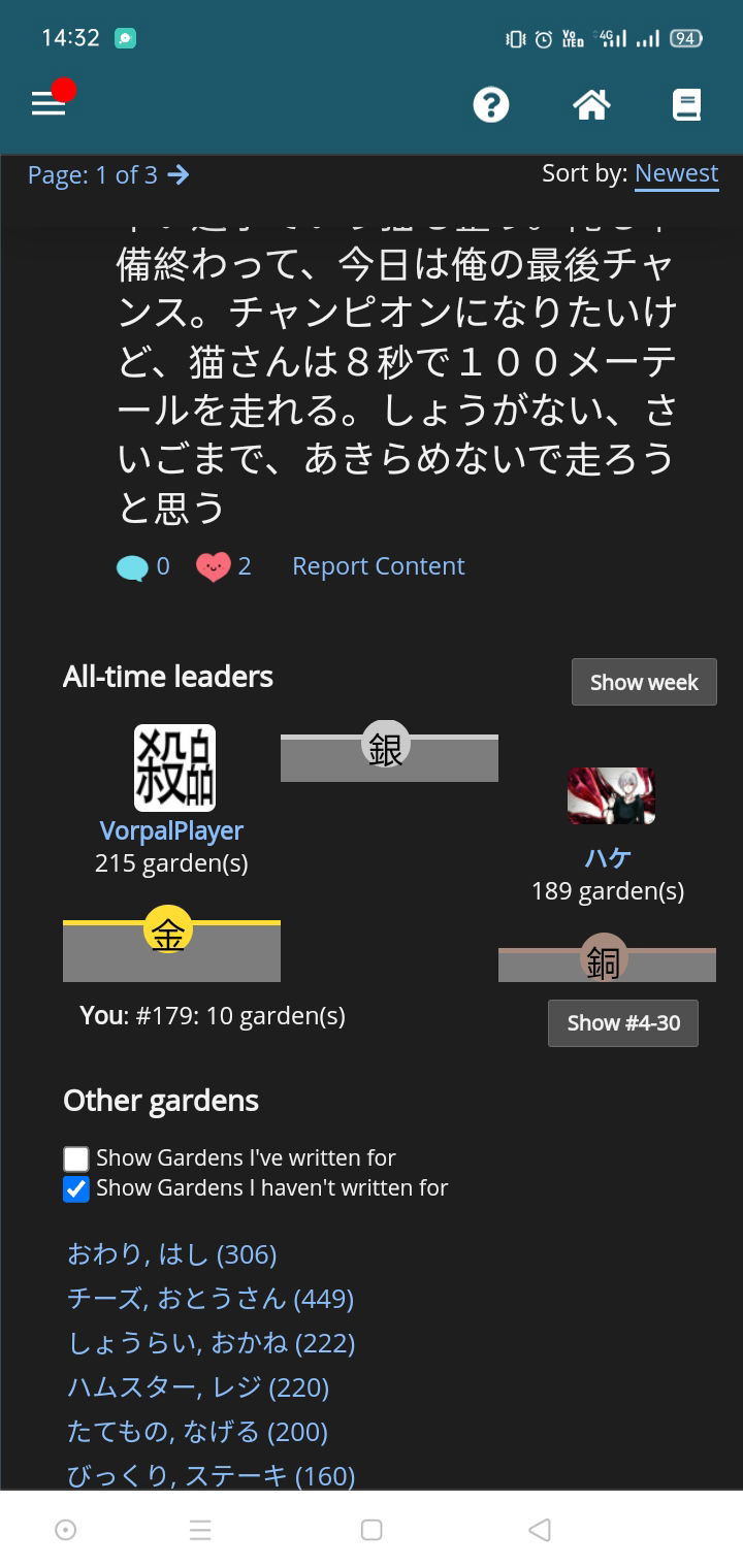
I found bug in the word garden all time leaderboard. The second place isn't align with the others:
