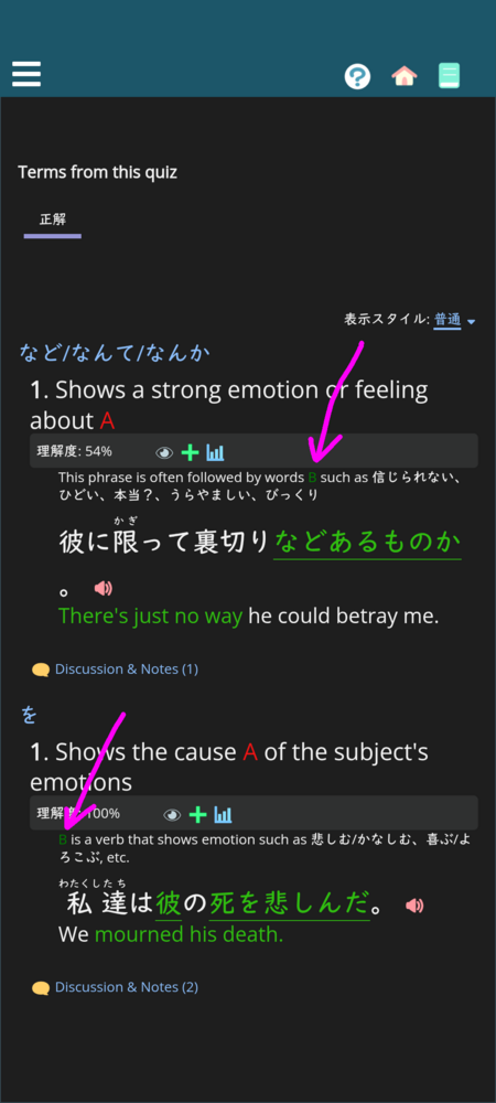
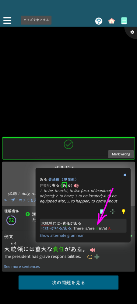
I think the A, B, C placeholders in grammar descriptions don't have sufficient contrast in dark mode. It depends on font size and background, both of which vary, but especially B becomes unreadable in smaller sizes on gray background. A and C are imo suboptimal too, but perhaps not as jarring. The same colors used for borders in grammar diagrams don't appear problematic to me, only when applied to text. The first screenshot below is from the last October, but is shows probably the worst case and these colors were the same as today.
yaaaaa i see u are mobile, on desktop i have same problem so i use custom CSS to change them to brighter colours that contrast better. there will be mods i think at some point where we will be able to save CSS to work on all platforms and share them. im looking forward to being able to have shared colour theming
It might not automatically update (I've always had a weird issue with the updates to the dark.css not propagating always), but I did brighten up several of the colors.