掲示板 Forums - 1st annual renshuu style (CSS) contest!
Top > renshuu.org > Announcements
Page: 2 of 2
Getting the posts
Page: 2 of 2
Top > renshuu.org > Announcements
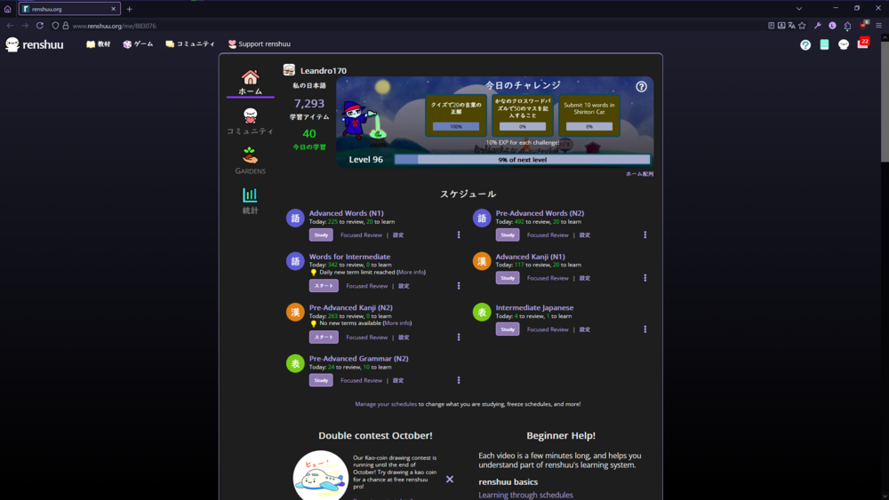
Hey. I have made my own personal style for renshuu and, while I believe it on it's own won't win any contest, I think some features would be cool if they were on the normal renshuu website. For clarification, I really like the colorscheme catppuccin (see https://catppuccin.com/), and use it everywhere including all my tools, and websites, so with that, I made one for renshuu some time back. That resulted in this, a purple colorscheme made to match the Mocha flavour with the Mauve accent color. One thing i really like about this (though it isn't perfect) is that a background gradient looks surprisingly better than a plain black background
I've also done a few changes to the quizzing area. One thing that always bothered me was the spaces inbetween words on word block questions, as I believed it would be better to challenge myself to get used to living without spaces inbetween words in japanese, so I made it as such
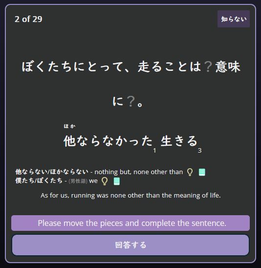
I've also put the question explanation thing to be justified towards the middle. The reason for this is that usually when quizzing kanji, I find it less hard to miss what type of question the question actually is, which helps me since I have the option to click to unhide answers enabled; I also admittedly really like text being centered. Before this, I'd oftentimes unintentionally ignore the question type and try to guess the kanji's meaning when I should've been guessing the reading.
Otherwise, the theme just changes a bunch of little things - Button sizes, colors, etc. It isn't perfect, particularly due to my difficulty going through renshuu's CSS, and I don't think it'll particularly win anything, as it wasn't made with a contest in mind, but I thought I should post it for any other purple lovers out there; My profuse apologies for the bad looking css. Link @ https://pastebin.com/pe0jXXhX - I should mention I used an extension called Stylus to implement this (which i do recommend over messing around with tampermonkey or other injectors) so I'm not sure if this will work for others, though it should work fine. Good luck to everyone else posting and I hope renshuu gets to look even more pretty and colorful with all your great styles - I'm already seeing some pretty cool stuff in here!
We haven't yet gotten too many entries, but there are a couple of days left!
Hi Everyone,
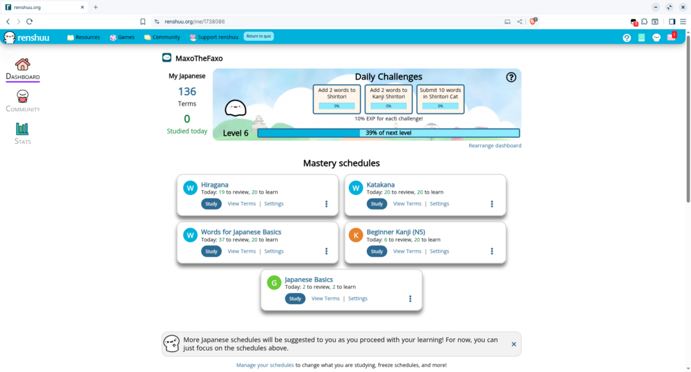
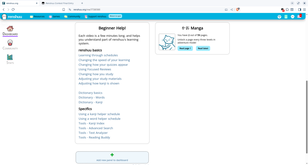
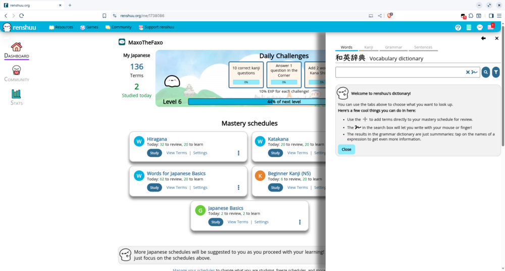
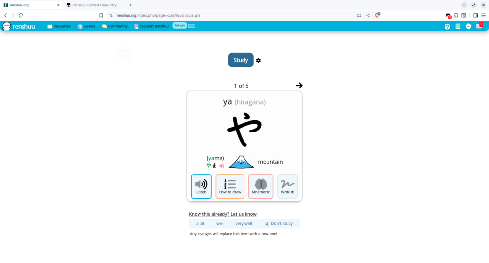
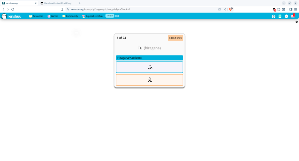
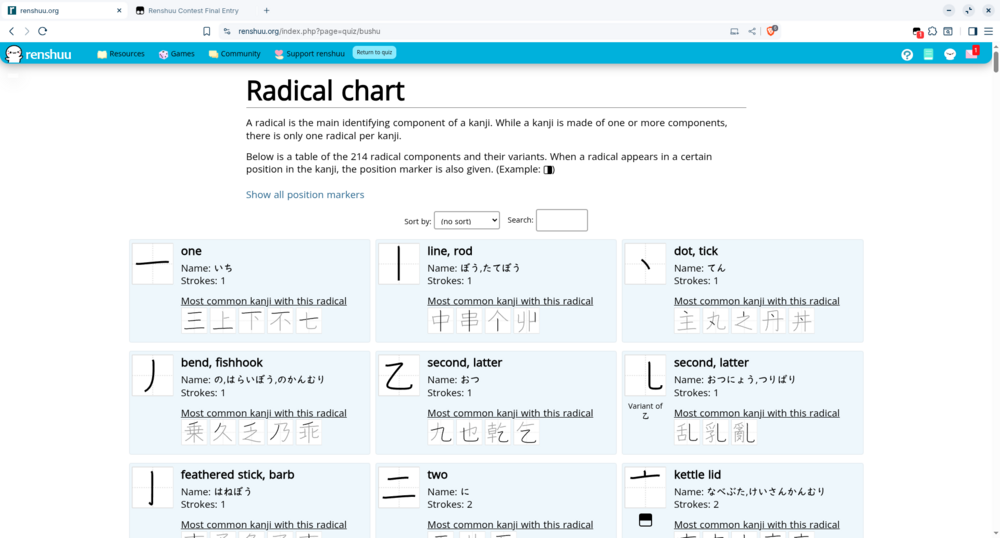
I'm new to Renshuu, I just started using it a few weeks ago in fact! I had been using Duolingo, but I found Renshuu to be much better for learning Japanese. As an aspiring web developer and someone who enjoys tinkering with UIs, I thought this would be a fun contest to enter. So, without further ado, here it is: KaBluey Light Theme, a light theme with lots of blue! It's not just a theme but also rearanges elements of the UI. It works on mobile as well. I haven't tested in dark mode, so it will probably have some issues there. I've tried my best to test it, however, Renshuu does have a ton of content, so if you spot a bug, please let me know.
Feature List:
- Several elements are now different shades of blue.
- I did away with the visible content wrapper entirely, so now the whole page background is white.
- Moved sidebars all the way to the very left of the page. I also made their position fixed, so you don't have to scroll back up to the top of the page to access them.
- Added borders, rounded corners, and padding to various components of the site.
- All pop-up panels are now at the very right of the screen, have no borders, and have a drop shadow.
- Navbar and pulldown menus have shadows, and rounded bottom corners.
- The daily challenge boxes in Adventure Mode and the action boxes on a new term intro get a little bigger when you hover over them.
- Quiz answer choices are now centered in their buttons.
- Centered the schedule list at the end of a quiz.
- Radical Chart is a table when there's enough room on the screen, not just a list.
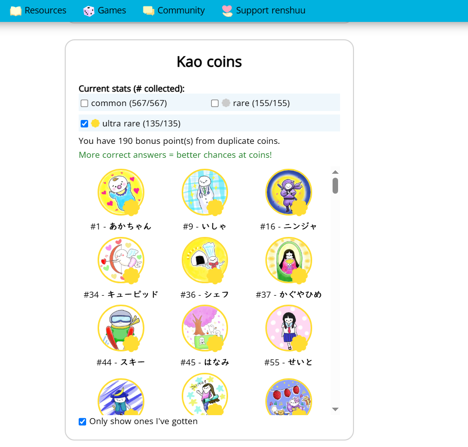
- I'm not the first one to do this, but I did make the Kao Coin area taller. I believe this should work, although I wasn't able to test it because I don't use Kao Coins, and when I tried enabling them I found I didn't have enough to be able to see it take effect.
There are several more small changes that KaBluey makes, please check out the source code!
Here's a demo video: https://drive.google.com/file/d/1ZCRjv8KAemIcwm7h5R5YpGZ4IZaawka6/view?usp=drive_link
Here's my commented code: https://gist.github.com/LightbulbProjects/efbf967c80d813f01dcda2a62c1be693
Screenshots:
I hope you like and enjoy the theme! :)
Looks great! We finally have a Light Theme :)
You mentioned that you couldn't test the Kao Coins, so I'll just post a screenshot so you can see what it looks like:
Thank you, I'm glad you like it! Thanks for posting the screenshot, it was very helpful.
Hi everyone,
The current renshuu CSS doesn't really bother me, the only things I could think of couldn't be done only using css, so I'm using this contest to experiment with styles.  (and because I want my garden coins
  )
)
I'm posting now even though I'm not satisfied because it's late and I want to secure the submission. I hope I'll have time to do the changes I want / more experimentations tomorrow.
Here are the changes:
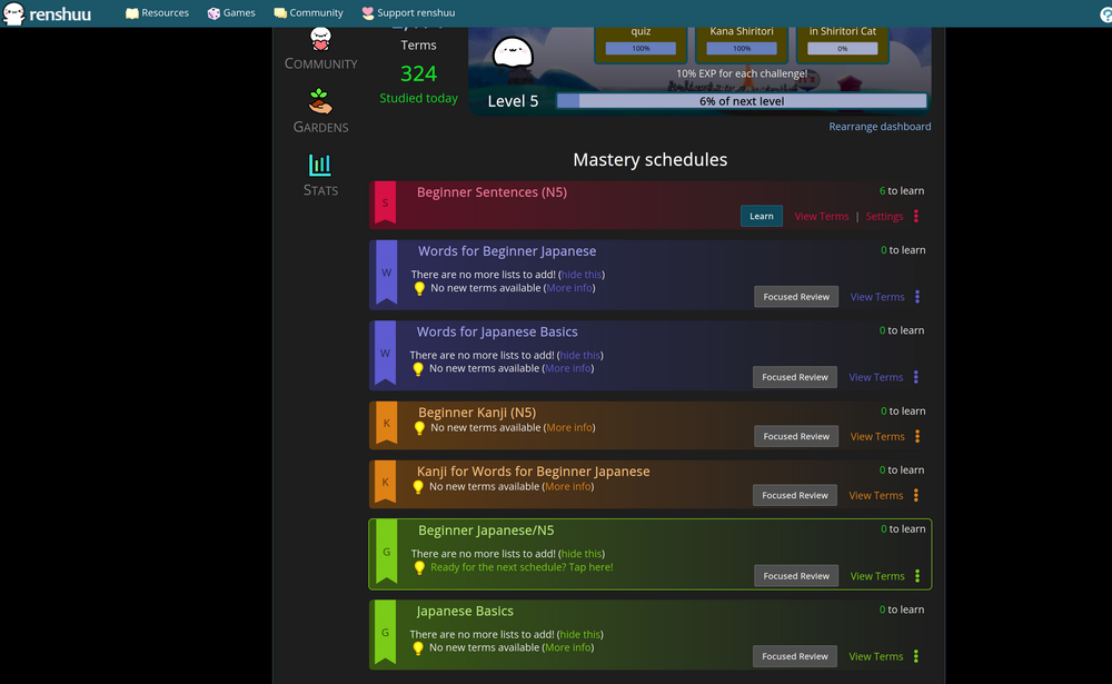
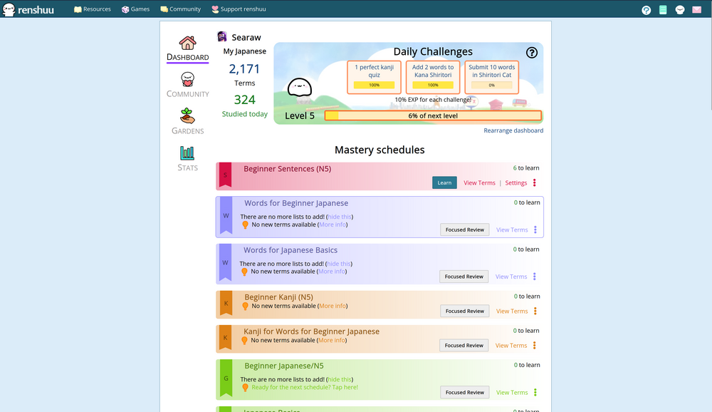
- It only changes the Mastery Schedules styles (If I did things correctly lol)
- Experimented with a rows layout
- Added some hover effects
- Added a gradient and adapted text to use the Schedule type color
- Made a bookmark shape because I thought it looked cool
- Should self adapt to dark mode with a single CSS
I don't know if it works on mobile, nor how to test it.
source code :
https://pastebin.com/niGPYn1j
Hi all!
I'm relatively new, started learning Japanese the end of summer this year as a hobby and I've come to really like the app. :)
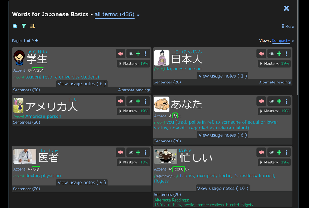
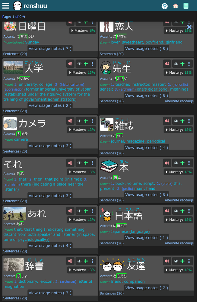
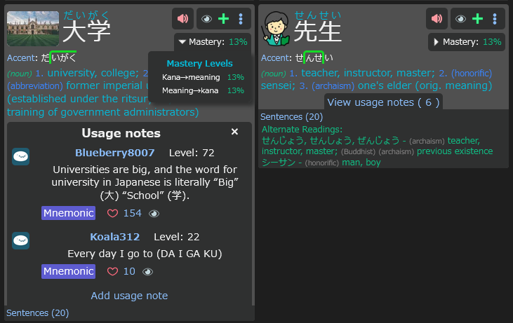
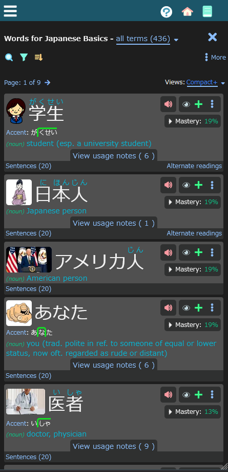
My CSS snippet focuses on redesigning and rearranging a very specific place in the page, which I use quite often, namely the Compact tab on the Schedule Viewer, since it is not as Compact as I would myself like it to be, I thought I'll do a little makeover.
My problem is that it feels a little cluttered, the buttons are a bit over the place, there is a lot of empty space in parts of the term boxes. With this snippet I aim to compact the term boxes even more, also making the buttons their own distinct place.
Main features include:
Here are some screenshots:
Hi,
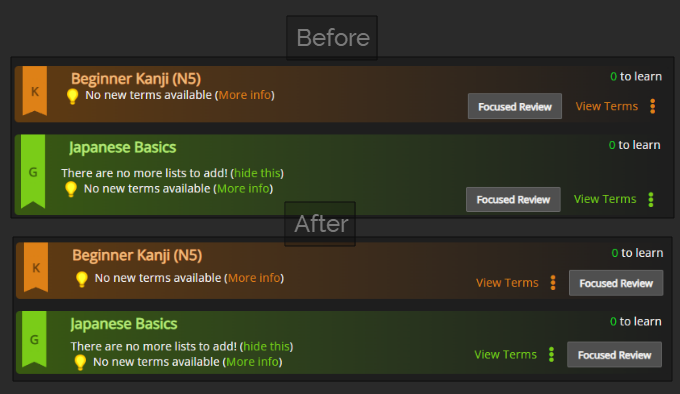
Here are little fixes from my previous post :
- adapted it to the quizz finished page, I didn't notice it broke some stuff there.
- Adjusted grid alignment of the text under schedule titles. schedules with text are no longer much bigger than the others.
- Adjusted horizontal alignment too so it has the same indent as the title.
- added margin to light bulb text if it is the first child so its not too close to the title.
- Moved the study button to the end of the tile
- Added the hover effect to the schedules in the quizz finished page as well.
new CSS : https://pastebin.com/rMgJnmvi
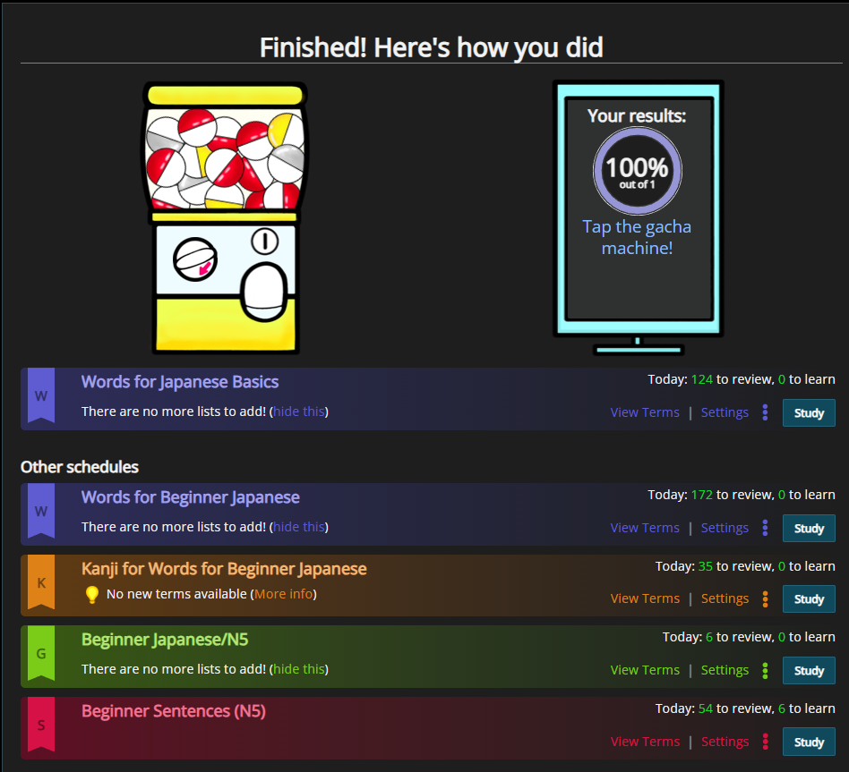
I dont know if there are other cases, but i'd like to test them, i'm thinking of when it suggests to add helper schedules. But I don't know how to trigger it.
if anyone knows any other case that are possible and how to trigger them, i'm interested.
ok, v3, then I promise I'm stopping.
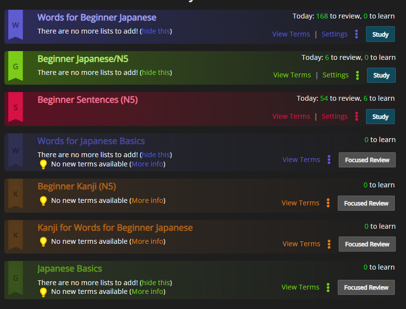
I wanted to try differentiating "done" schedules:
I'm using the presence of "settings" for this so it may not be accurate enough to replace v2 but it works. (it just depends on the behaviour of the settings button, which I don't know)
I also fixed a slight indent of odd/even tiles.
https://pastebin.com/hN4ytunP
I know it's too late, but just in case, here is a version that should work on mobile too (I don't know if the feature is going to be deployed on both the app and the website) : https://pastebin.com/qnAbeydW
before :
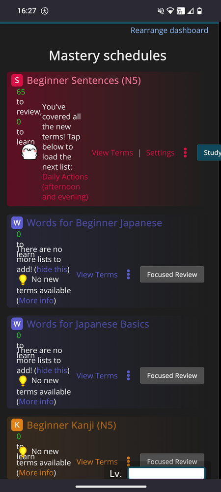
after :

The contest has ended! Due to the format of this contest, although I will be able to report winners sooner than not, actually doing something with these entries will take much more time.
Thank you all for waiting! I got a bit carried away with development of another feature, pushing the results back on these.
Unlike the Kao-coins, these are somewhat hard to summarize, so I will only list the names and brief description of each entry. The order in each group is random, and is not meant to represent the specific order.
Gold (#1-3)
Umbersage: Wide-screen support
ギョルギ九十三: All around theme replacement
Vinicius: Halloween Theme
Silver (#4-6)
odenatus: Apollo color theme
Leandro170: Theme + quizzing changes
Searaw: Theme and layout changes
Bronze (#7-10)
フィラル - Conjugation table changes
MaxoTheFaxo - Light theme
ヤウリトゥ - Compact view changes
斗真 - Minor visual adjustments
Shortly after posting this, I'll be sending the prizes to your renshuu inbox.
How this will be integrated into the future
JS mods were requested, and I saw a strong emphasis on color changes. renshuu used to have color settings, so I'd like to revive that.
My hope is for late winter/early spring of 2026 to be a starting point for a "renshuu mods" section of the page where users can post these, get ratings/feedback/etc. Anything that has the potential to extract user data (like JS) will be vetted before any other user can download it to prevent any of that from happening.
I have a LOT to think about with regards to this, and so I'll post again (probably January/February) when I begin the discussion on how to create this feature!
Congrats to the winners! And もちろん the ones who even participated!! がんばれ!
Thanks! It was a lot of fun :)
Btw, can I gift the 6 months Pro to someone else? I have lifetime.
The code cannot be gifted directly, but if you let me know who you'd like to apply it to, I can do that for you!