I would like to suggest a small UI improvement on the "Analysis" part of the Text Analyzer.
Add the little page widget that's at the top of the list to the bottom of the list (when filtering or such). When the list is long it's a bit annoying to scroll back up.
Top:
Bottom:
Beyond that, I don't know if it's intentional or not but the "+ Add" button doesn't follow the UI theme of the search window. In Text Analyzer the "+" is always green — in search it's hollow when you don't know a term and green when you already have it on a schedule. Would be nice if this was the case in Text Analyzer as well!
I am unable to provide any improvements at the moment. However, if you can give me a specific text/word that has the + button issue, I will be happy to look into that when I get a chance.
First, thank you for creating this awesome Text Analyzer feature it’s been a godsend for me!
It would be great if the Text Analyzer included an option to change the sorting order. Currently, it sorts by submission order, but having a custom sort option would be very useful.
Here are a few additional quality-of-life improvements that could really enhance the experience:
Multiple selection for grouping or deleting items.
Currently, batch deleting a group only removes the group title and leaves the content ungrouped. It would be great to have an option to delete the group along with its content.
The ability to edit the title name directly from the main Text Analyzer screen (without opening each analyzed text) would make things much easier.
Adding a Renshuu API for the Text Analyzer could be a powerful tool for developers.
Lastly, I’ve noticed that when reading novels using the Text Analyzer, it sometimes breaks kanji into kana, and character names written in katakana are sometimes converted into hiragana. If possible, please consider adding an option to preserve the original formatting of the source text, this will help a lot on novel reading.
However, if you can give me a specific text/word that has the + button issue, I will be happy to look into that when I get a chance.
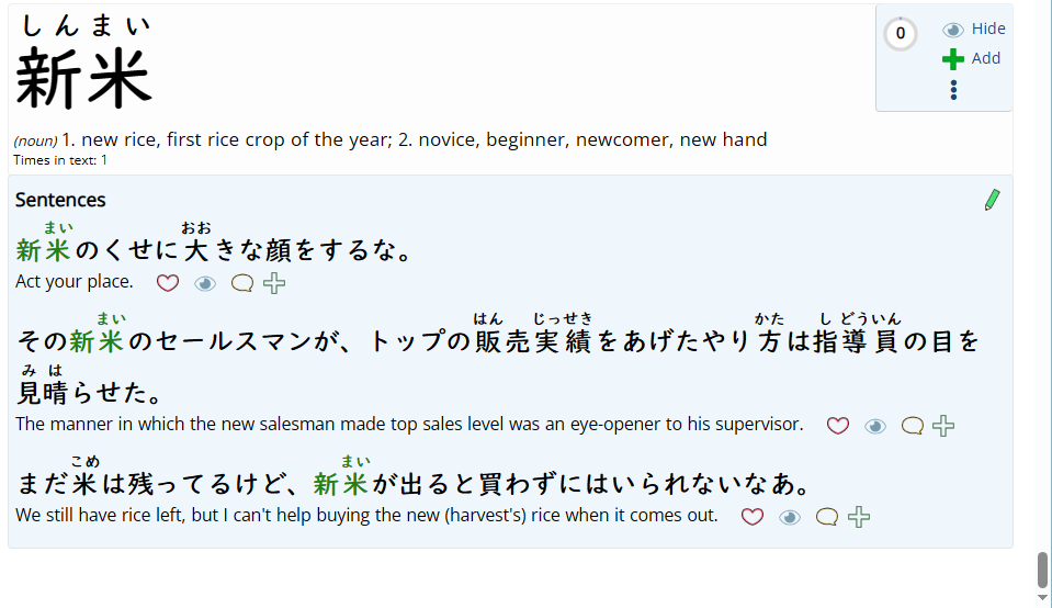
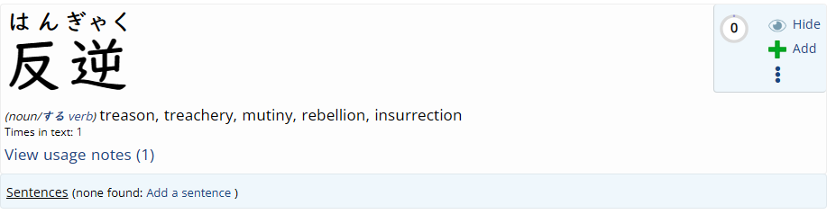
It's literally all of them, as an example from within the text analyser:
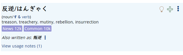
Same word in the search window shows the + as hollow when not known:
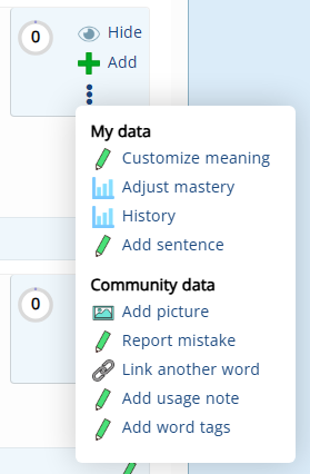
Related to this, it would be very nice if (when/if you get back to adding improvements) I could mark words as known with the little lightbulb from inside the text analysis page as well. Currently there's no way I can see as to how to do this:
Thanks for the report - I checked your account, and did not see any remaining texts in the analyzer. If you can upload a short one that exhibits the issue, let me know and I'll be happy to check it out.