I'm new to the site + japanese learning, so I might just need to acquire an eye for noticing the differences. However, for the vocabulary study intro boxes (the sliding ones you get before starting a quiz) I've found it very difficult to distinguish the small-sized "ゃ/ゅ/ょ" from normal-sized "や/ゆ/よ" Furigana above unlearned Kanji.
I've gone into the web element explorer to manually input both big/small kana versions to see if there is an actual difference in size, which there is, but it's somewhat subtle for a beginner like me. So my suggestion would be to modify font characteristics of the ruby text elements in introductory vocab study cards such that size difference between little/normal characters is more noticeable.
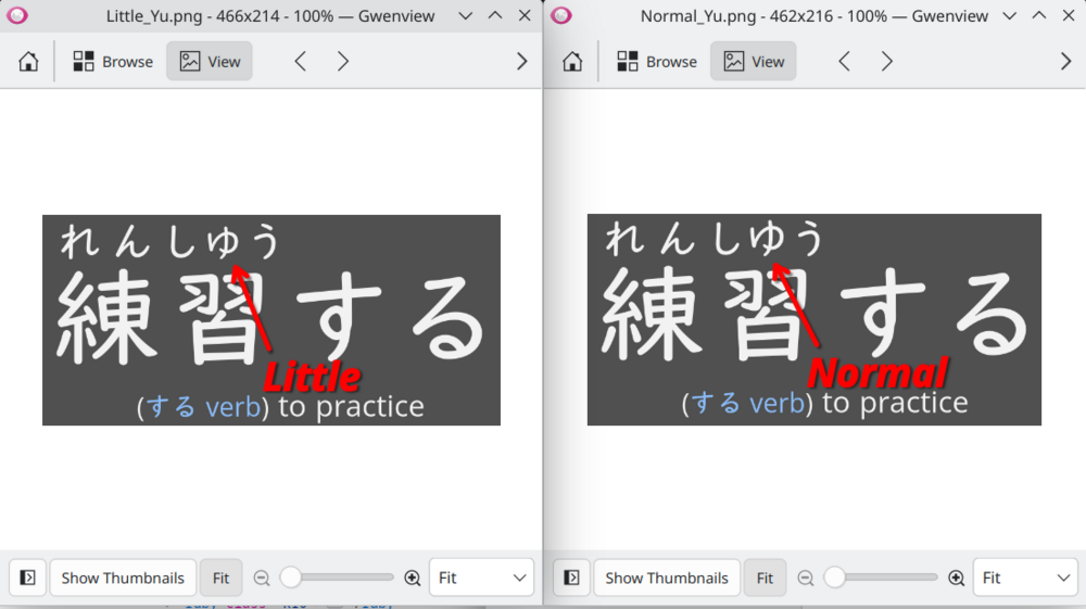
Here's a side-by-side comparison of my 練習する intro sliding box vocab card after manually editing it in Firefoxes' element explorer: (Putting them together, I can definitely tell the difference, but seeing it alone I usually can't)
Definitely not the biggest issue, since I can instantly look it up by clicking the Kanji, but I find it mildly frustrating, at least for now until I can learn to see the difference in the wild.
The size ratio between big <-> small furigana characters doesn't seem to change with global zoom. Just makes it bigger overall, which is probably somewhat helpful. Nothing a good pair of 眼鏡 wouldn't fix though :) (although that is something I'm now considering...).
Also I usually can clearly see the difference between しゅう and しゆう in the normal typeface font or in the dictionary, but for some reason I struggle with the intro vocab cards specifically.
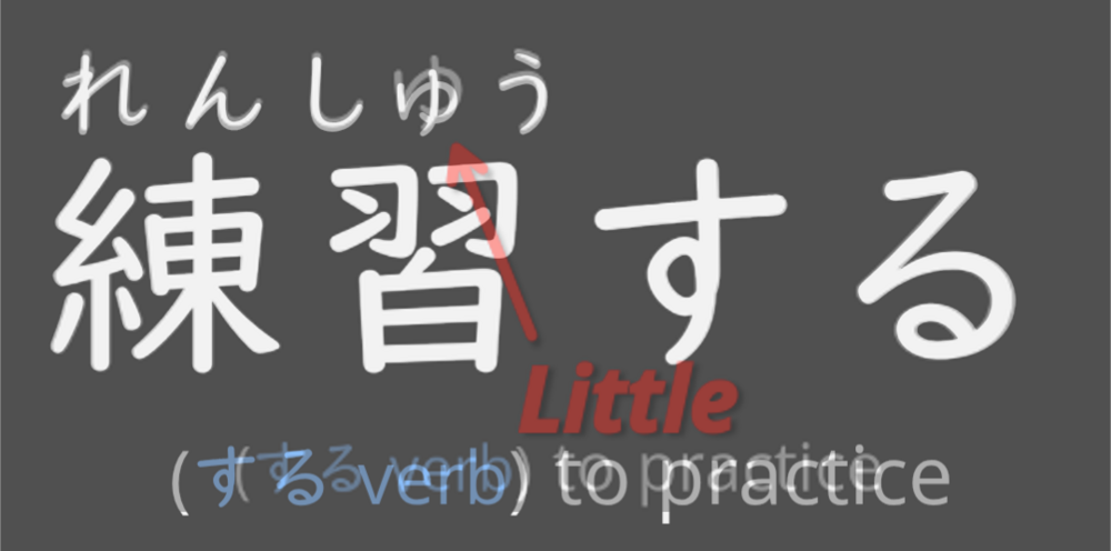
So I did a thing. I was curious so I opened the app on my mobile android phone to see if I could tell the difference. Turns out I *could* clearly see the little ゅ on my phone. But it had me staring very closely between my laptop screenshots and my phone side-by-side, and in a bout of frustration I decided to test both out by overlaying screenshots.
I overlaid my laptop's screenshot (slightly transparent, as indicated by red arrow) over my mobile phone's screenshot, and tried to align them as best I could:
I think this illustrates that there's definitely something significantly different about the little furigana characters (specifically the introductory vocab card furigana-above-kanji characters) between some platforms. FYI: Renshuu on my laptop is running on Firefox in Fedora Linux, so maybe its a default font issue with my laptop or the browser.
This is an interesting topic. You're talking about the actual sizing of the font itself, and nothing with how renshuu itself presents it. There isn't any code at the moment that says "ok, size characters differently depending on what they are" - and so the only solution (if it is a solution) would be to so in, scan for, and add css to shrink down those characters wherever they appear.
I do not think this is something that I can fix, though - for example, it looks just fine on my version of firefox (desktop), and so any change to the font size for just those characters would make them *too* small on some (many?) other devices/browsers.
Thanks for your response! Fair enough, I too think a solution that shrunk specific characters based on context is not ideal, especially since this is demonstrably not an issue on platforms other than my Fedora Linux laptop (typing from a windows desktop right now on Firefox, and the quiz card looks fine). In other words, the risk to fix it is greater than the problem being solved.
I'm personally still intrigued as to why my Linux laptop hiccups on the ruby text annotation specifically, but I'll drop it since that's my own hyper fixation (AKA: procrastinating by distracting myself from what I should actually be doing: my vocab quizzes )
Sorry for necro-bumping, but I have some minor updates to report for this that might be useful info. First of all, this appears to be a Firefox specific issue on Linux, for small Furigana characters in ruby text fields. I have 3 new pieces of information to report:
I have another machine running a different Linux Distro (Manjaro) that is able to replicate this issue.
On all my Linux machines, Brave browser (Chromium-based) does not have this issue, only Firefox.
To answer your previous question, it only happens on the "Textbook" Font, (AKA: font-family: "UDDigiKyokasho M JIS2004", 'Open Sans' !important;)
The Basic and Serif-Style Fonts have no issues.
So I still have no idea why the Textbook style font has inconsistent behavior for rendering small furigana characters, in ruby text fields, but I hope this at least narrows down the issue to:"UDDigiKyokasho" font, on Firefox, on Linux.
TLDR:
Fedora Linux:
Firefox: UDDigiKyokasho, X <- small Furigana characters render "bigly"
Brave: UDDigiKyokasho, ✓
Manjaro Linux:
Firefox: UDDigiKyokasho, X <- small Furigana characters render "bigly"
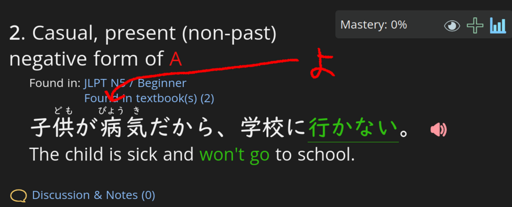
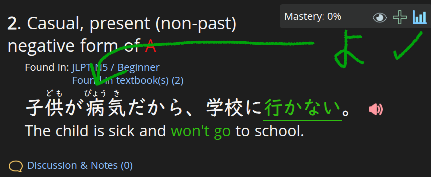
And I just saw now it also happens elsewhere on the site, as shown here in Grammar section, so my previous assumption that it's limited to just vocab study cards is false.
By chance, do you have renshuu pro? If not, I can give you a week or two of it, as I'd love to see if you can replicate it with any of the renshuu pro fonts. They are delivered in the same way that the textbook font is, so if it's a bug with that delivery system, I can pass it back to the font company.
I do not have Renshuu Pro right now, although I thought i recalled there being a temporary trial option which I can't find for the life of me right now (maybe during the last sale?). If you could grant me a temporary pro subscription I definitely could compare the premium fonts and report my findings here or somewhere else.
I'm also on the Discord under Tealtime as well, if you'd rather me post there.


 )
)
 .
.