掲示板 Forums - UI improvements
Top > renshuu.org > Developer corner Getting the posts
Top > renshuu.org > Developer corner
via discord
also see
i think the whole app is some kind of website, you can use css mix-blend-mode: difference for the progress bar text for it to look good, just look up the css property
perfect nested border radius css tutorial
these are just not aligned at all. i'd suggest making a css grid with 5 1fr columns and a small gap, and then i suggest make a layout like this:
do not actually add the table borders, it's only to show how it's divided
i think css grid is very well suited for this task, but a plain old html table with hidden borders will suffice
very good css grid tutorial
Although I cannot guarantee a fast response on any specific issue (or even a guarantee that I'll make the change), very specific improvement suggestions like these are extremely helpful, and make it much easier for me to consider an improvement. Thank you in advance!
Icon buttons like the ones from the right hand side navigation
should have `title` attributes so browsers show toolips
Helps users that aren't super familiar with the interface yet.
Also the icon images should have `aria-hidden = true` on them.
( For more info on the topic : Accessible Icon Buttons )
I have not forgotten this thread! It's just been a ...really bad (health/time-wise) second half of the year for me. I cannot wait to be able to have the time to start working on these changes!
Made a few of the easier changes:
1. Better spacing on Kao Manga. Not sure adjusting the thumbnail makes sense, since you're looking at it on a specific width. Other widths, the image is larger than the text/buttons on the right.
2. Better kana chart.
3. Fixed spacing on "add new panel" box.
4. I darkened the background on the adventure box. Did not adjust anything else up there yet - I think I'll change the colors of the progress bars, but I already get a *lot* of flak for the number of font-sizes in renshuu, so I'm not sure making that text smaller is ideal, nor do I like the radial progress bar for the quests.
There's been a long time peeve of mine:
I used to be comfortable with the font size on mobile. I have a lot of blank space on the side margins when it comes to the PC browser, which is understandable. But when I use my computer's web browser, the default text is super tiny. This causes me to want to increase the size, preferably max, but there are problems:
The reason both are tied is because I want my progress to be linked. I actually don't get why there has to be two settings for that in the first place when it is not necessary. The settings nonetheless mention that's a thing. If not, it would be confusing, but I certainly would not risk it. Hence, my dilemma.
It should be a choice, IMO. In spite of that, the nature of linking my quiz progress between the two, one is a visual detriment to the other.
I have found middle ground. It's just not ideal with respect to what I want. IMO, quiz progress should not be linked to the UI. By nature of the additional UI problems mentioned above as well, it's not compatible for one or the other.
Can you please show some screenshots to help illustrate the problem you're seeing?
Screenshot? It's exactly what it is. Embiggen one, the other is yuge too. But one is more pleasing than the other. Everything has to basically fit in their fixed boundaries as a result.
My apologies for the delay - I've been in and out of multiple illnesses, yuck!
Screenshots are required because what you're seeing is not what everyone else sees - it could be a combination of your renshuu settings, browser, location in renshuu, other things on the screen, and a number of other things. I fully believe that you have a legitimate issue that should be looked into, but given the size and complexity of renshuu, it's simply not something I can move forward on until I have clear and specific examples of the issue(s) taking place.
I'm not sure how it could be different from what everyone sees. I've literally described what it is like. You enlarge the UI on either type of device, the enlargement globally affects all devices. That's as simple as it is and how it behaves. I know that CSS controls that sort of thing, but that's not the user's side.
Any alignment issues are more visible in one way or another from that.
Thanks for the response. If you are not interested in putting up screenshots, that's fine - it will simply make it much harder for me to address the issue, and given my limited time, I'm going to focus on issues that I feel I can get the most "bang for my buck" in terms of helping the learners on renshuu.
For a lot of people, the text-size is just fine (and of course, for others, it is not). So there is not a universally objective "this is *too* small or *too* large" (aside from extreme examples) that everyone is going to agree with.
On top of that, there are a ton of things in renshuu that adjust font-sizes based on multiple factors specific to that single screen at that single point in time. A few examples:
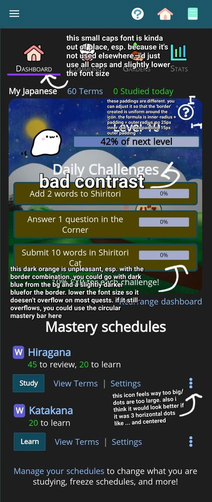
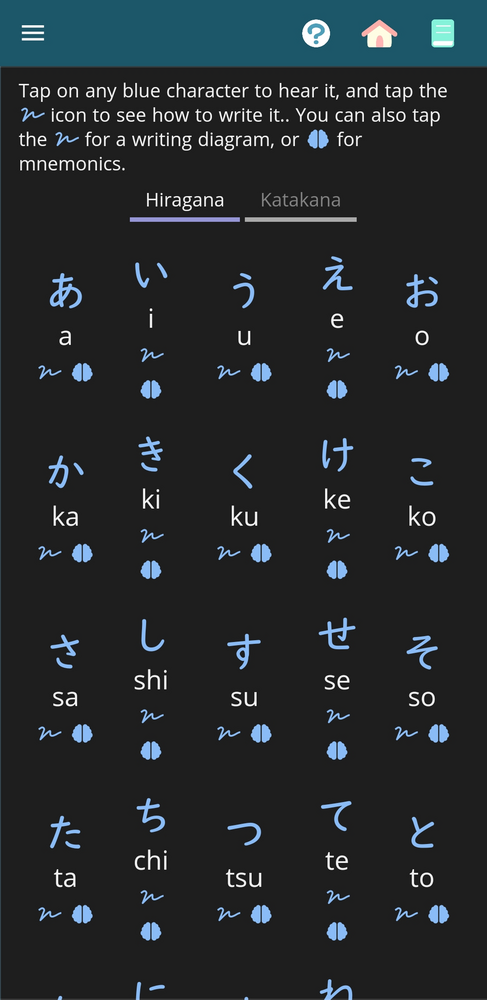
(Sorry if you already know this) - There are things called breakpoints in CSS where you can change values based on the width/height of the device's screen. The Kana Chart (under Resources does this. It REALLY needs to be 5 columns width (due to the structure of kana), but keeping a fixed font size doesn't work here, so the font shrinks at certain, smaller device screens. So in this case, it may be one person saying "hey, this font is too small", and without a screenshot, I cannot ascertain which font-size is being delivered to them.
One more example: while it's not always possible, there is a sliding scale of font-sizes for vocabulary terms in quiz questions (as well as a setting to turn this on/off) - for mobile screens, it helps many to have the a size of "200" for the word わたし, but you'd get the word wrapping to two lines if the same size is used for ありがとうございます, so the size is adjusted to 120. Again, this would change depending on the device, and definitely look different when comparing the desktop version to the mobile one.
Lastly, there is the distinct possibility of an unexpected set of factors/settings combining to create the issue on your device - a bug, or something similar. I've had visual issues before that, even on a page that is hit hundreds of thousands of times every day, affected (as far as I knew, and I have a lot of users who helpfully point out even the smallest of bugs to me) maybe 1 out of 10,000 people.
I am unable to explain any more beyond this - I'd love nothing more than to help you with your issue, but for visual issues, screenshots are the bare minimum amount of information/data that I need before I can move forward.