掲示板 Forums - Furigana displaying weirdly. (Moved)
Top > renshuu.org > iOS renshuu Getting the posts
Top > renshuu.org > iOS renshuu

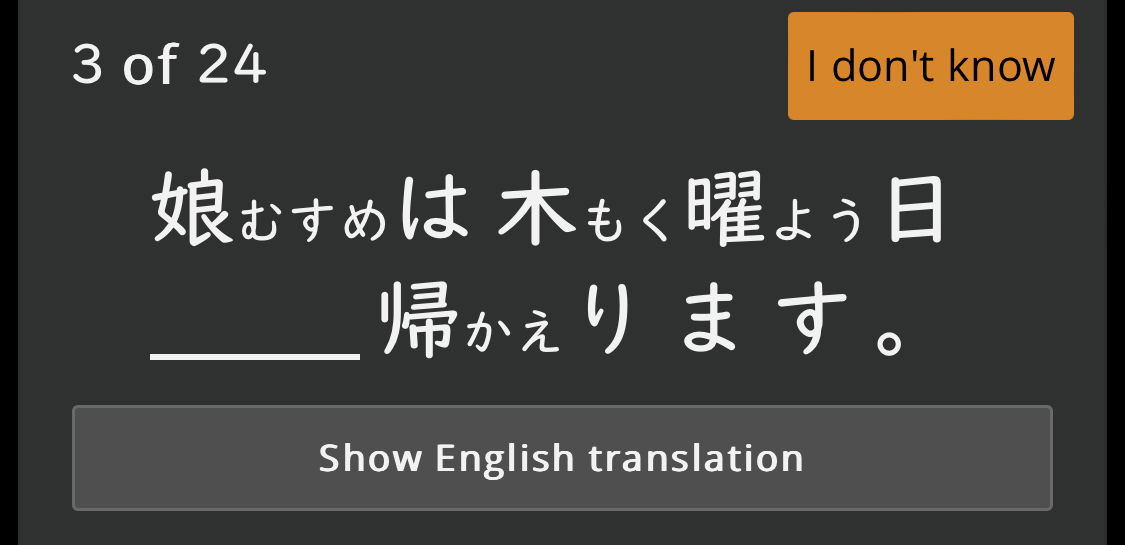
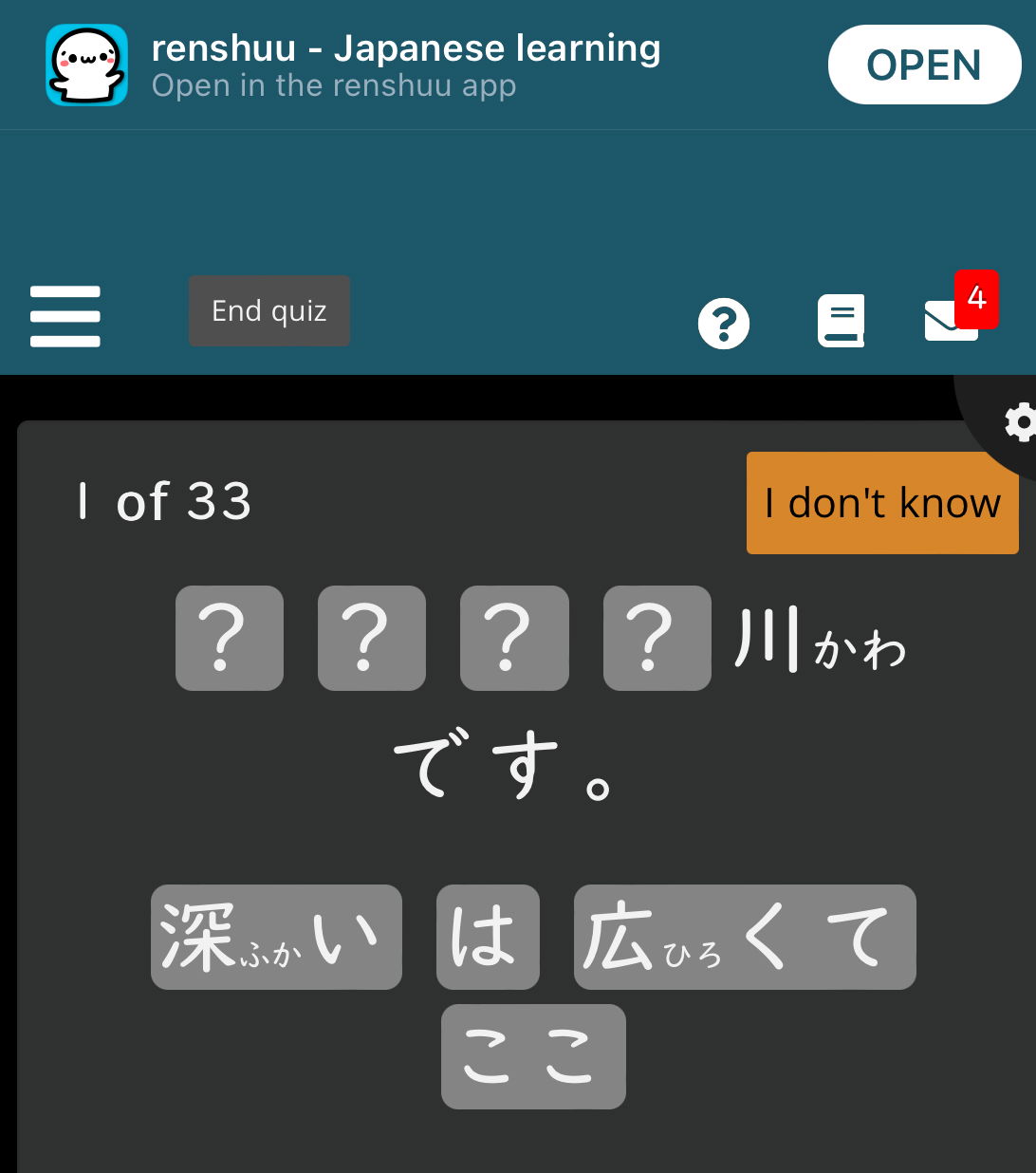
Furigana for most kanji displays like this to the side for some reason and I can’t find a way to turn it off. I already tried changing the way kanji is displayed in the Vocabulary settings but that didn’t work. Is this a bug?
Are you using the app (And if so, what device/os version), or a web browser?
Oh, my apologies - you're on iOS. That is definitely not expected behavior - what iOS version are you on?
I’m using the latest 17.4 beta. That might be the issue.
Oh, my apologies - you're on iOS. That is definitely not expected behavior - what iOS version are you on?
I have not yet tested it on the beta, so it is certainly possible (although it would still be surprising.) If that's the case, then it's actually a bug inside of safari (which renshuu uses to render the pages).
Let me ask you this - if you open up Safari and load renshuu.org (the website) on there, do you have the same issue?

Still the same issue even in Safari.
I have not yet tested it on the beta, so it is certainly possible (although it would still be surprising.) If that's the case, then it's actually a bug inside of safari (which renshuu uses to render the pages).
Let me ask you this - if you open up Safari and load renshuu.org (the website) on there, do you have the same issue?
In that case, this may be a safari issue (within the beta). Said simply, the furigana placement is done using very standard html elements (nothing crazy at all), so it's almost definitely not renshuu "programming". I'm hoping someone else on 17.4 beta can chime in. Once I get things calmed down, I can probably spin up a copy of it in an emulator, but the transition to the new server is still taking most of my time.
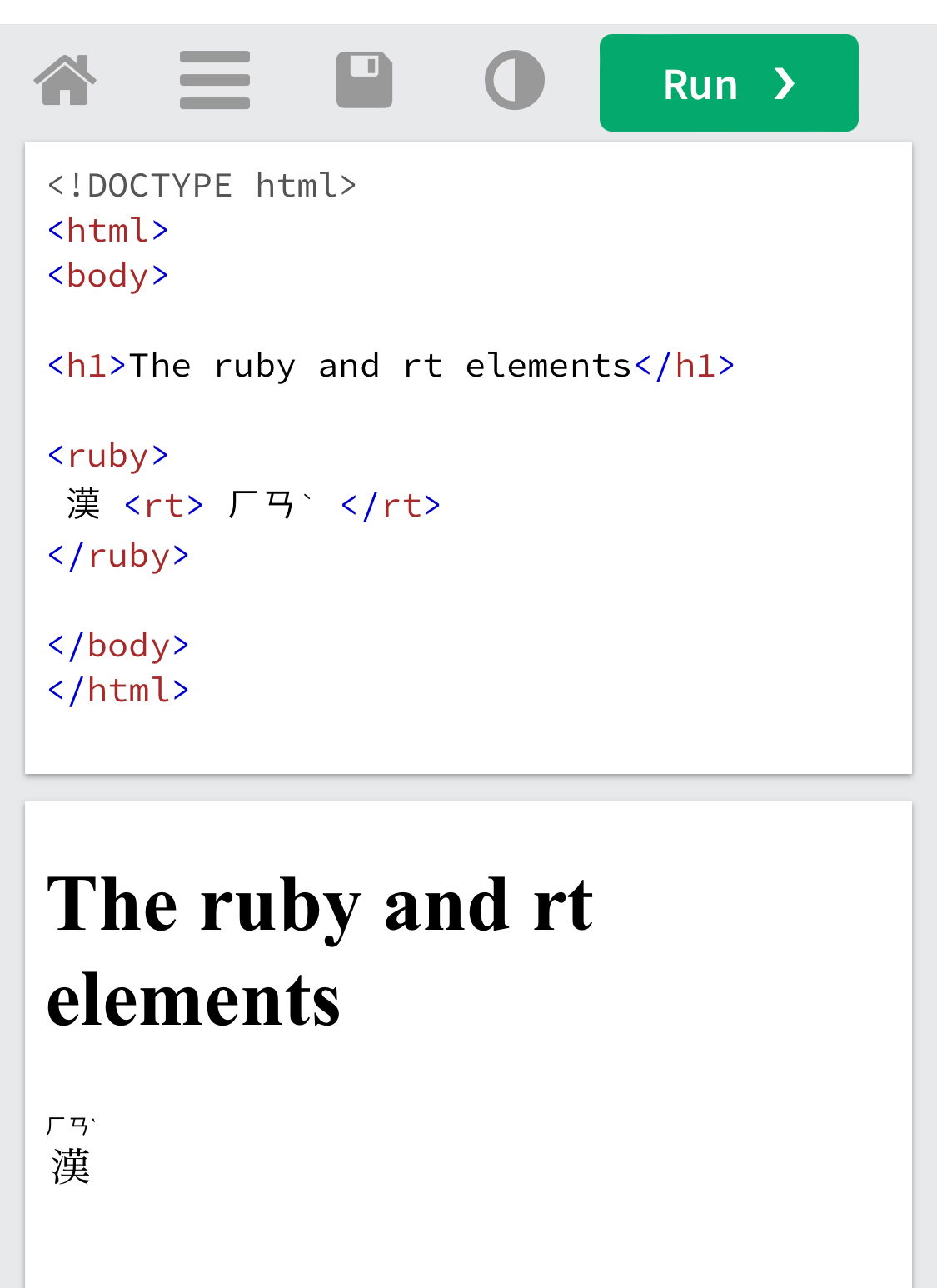
The sizing on this page is atrocious, but please go here: https://www.w3schools.com/tags...
It should have a kanji with some writing above it on the right side (although not quite sure how well it'll show up on a mobile device). How does it look to you?

Looks like this for me.
In that case, this may be a safari issue (within the beta). Said simply, the furigana placement is done using very standard html elements (nothing crazy at all), so it's almost definitely not renshuu "programming". I'm hoping someone else on 17.4 beta can chime in. Once I get things calmed down, I can probably spin up a copy of it in an emulator, but the transition to the new server is still taking most of my time.
The sizing on this page is atrocious, but please go here: https://www.w3schools.com/tags...
It should have a kanji with some writing above it on the right side (although not quite sure how well it'll show up on a mobile device). How does it look to you?
In that case, it might indeed be renshuu. I'll need to put a pin in this, though, until I'm able to test it out with the 17.4 beta. So sorry about that!
Checking in here. I'm also on the latest iOS beta and am running into this issue.
Alright - I'm installing the beta on my ipad, will hopefully have some info soon.